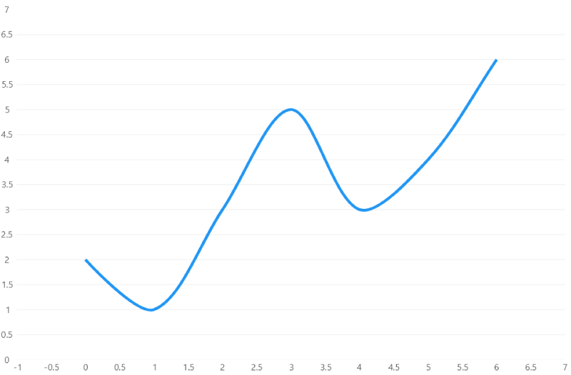
Polar Line Series
This article do not include all the properties of the Polar Line Series class, it only highlights some features, to explore the full object checkout the API explorer
Name property
The name property is a string identifier that is normally used in tooltips and legends to display the data name, if this property is not set, then the library will generate a name for the series that by default is called "Series 1" when it is the first series in the series collection, "Series 2" when it is the second series in the series collection, "Series 3" when it is the third series in the series collection, and so on a series n will be named "Series n".
SeriesCollection = new ISeries[]
{
    new PolarLineSeries<int>
    {
        Values = new []{ 2, 5, 4, 2, 6 },
        Name = "Income", // mark
        Stroke = null
    },
    new PolarLineSeries<int>
    {
        Values = new []{ 3, 7, 2, 9, 4 },
        Name = "Outcome", // mark
        Stroke = null
    }
};
Values property
The Values property is of type IEnumerable<T>, this means that you can use any object that implements the IEnumerable<T> interface,
such as Array, List<T> or ObservableCollection<T>, this property contains the data to plot, you can use any type as the
generic argument (<T>) as soon as you let the library how to handle it, the library already knows how to handle multiple types,
but you can register any type and teach the library how to handle any object in a chart, for more information please see the
mappers article.
var series1 = new PolarLineSeries<int>
{
    Values = new List<int> { 2, 1, 3 }
};

// == Update the chart when a value is added, removed or replaced  == // mark
// using ObservableCollections allows the chart to update
// every time you add a new element to the values collection
// (not needed in Blazor, it just... updates)
var series2 = new PolarLineSeries<double>
{
    Values = new ObservableCollection<double> { 2, 1, 3 }
}
series2.add(4); // and the chart will animate the change!

// == Update the chart when a property in our collection changes  == // mark
// if the object implements INotifyPropertyChanged, then the chart will
// update automatically when a property changes, the library already provides
// many 'ready to go' objects such as the ObservableValue class.
var observableValue =  new ObservableValue(5);
var series3 = new PolarLineSeries<ObservableValue>
{
    Values = new ObservableCollection<ObservableValue> { observableValue },
}
observableValue.Value = 9; // the chart will animate the change from 5 to 9!

// == Passing X and Y coordinates // mark
// you can indicate both, X and Y using the Observable point class.
// or you could define your own object using mappers.
var series4 = new PolarLineSeries<ObservablePoint>
{
    Values = new ObservableCollection<ObservablePoint> { new ObservablePoint(2, 6)}
}
// == Custom types and mappers == // mark
// finally you can also use your own object, take a look at the City class.
public class City
{
public string Name { get; set; }
public double Population { get; set; }
}// we must let the series know how to handle the city class.
// use the Mapping property to build a point from the city class
// you could also register the map globally.
// for more about global mappers info see:
// https://livecharts.dev/docs/unowinui/2.0.0-rc2/Overview.Mappers
var citiesSeries = new PolarLineSeries<City>
{
Values = new City[]
{
new City { Name = "Tokio", Population = 9 },
new City { Name = "New York", Population = 11 },
new City { Name = "Mexico City", Population = 10 },
},
Mapping = (city, point) =>
{
// this function will be called for every city in our data collection
// in this case Tokio, New York and Mexico city
// it takes the city and the point in the chart liveCharts built for the given city
// you must map the coordinates to the point
// use the Population property as the primary value (normally Y)
point.PrimaryValue = (float)city.Population;
// use the index of the city in our data collection as the secondary value
// (normally X)
point.SecondaryValue = point.Context.Index;
}
};Automatic updates do not have a significant performance impact in most of the cases!
DataLabels
The the following block uses the PieChart class as an example but all labels in polar series work the same way.
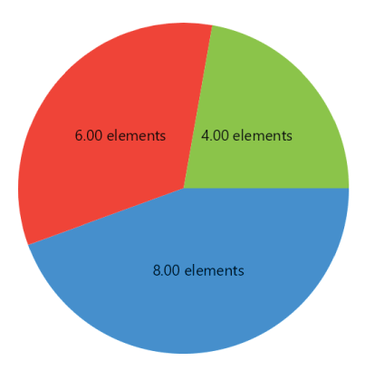
Data labels are labels for every point in a series, there are multiple properties to customize them, take a look at the following sample:
Series { get; set; } = new List<ISeries>
{
    new PieSeries<double>
    {
        Values = new List<double> { 8 },
        DataLabelsPaint = new SolidColorPaint(SKColors.Black),
        DataLabelsSize = 22,
        // for more information about available positions see:
        // https://livecharts.dev/api/2.0.0-rc2/LiveChartsCore.Measure.PolarLabelsPosition
        DataLabelsPosition = LiveChartsCore.Measure.PolarLabelsPosition.Middle,
        DataLabelsFormatter = point => point.PrimaryValue.ToString("N2") + " elements"
    },
    new PieSeries<double>
    {
        Values = new List<double> { 6 },
        DataLabelsPaint = new SolidColorPaint(SKColors.Black),
        DataLabelsSize = 22,
        DataLabelsPosition = LiveChartsCore.Measure.PolarLabelsPosition.Middle,
        DataLabelsFormatter = point => point.PrimaryValue.ToString("N2") + " elements"
    },
    new PieSeries<double>
    {
        Values = new List<double> { 4 },
        DataLabelsPaint = new SolidColorPaint(SKColors.Black),
        DataLabelsSize = 22,
        DataLabelsPosition = LiveChartsCore.Measure.PolarLabelsPosition.Middle,
        DataLabelsFormatter = point => point.PrimaryValue.ToString("N2") + " elements"
    }
};
The series above result in the following chart:
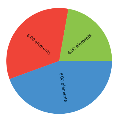
You can also use the DataLabelsRotation property to set an angle in degrees for the labels in the chart,
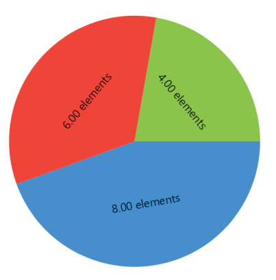
notice the constants LiveCharts.CotangentAngle and LiveCharts.TangentAngle to build labels rotation.
This is the result when we set all the series to LiveCharts.CotangentAngle:
And this is the result when we set all the series to LiveCharts.TangentAngle:
Finally you can also combine tangent and cotangent angles with decimal degrees:
Series { get; set; } = new List<ISeries>
{
    new PieSeries<double>
    {
        DataLabelsRotation = 30, // in degrees
    },
    new PieSeries<double>
    {
        DataLabelsRotation = LiveCharts.TangentAngle + 30, // the tangent + 30 degrees
    },
    new PieSeries<double>
    {
        DataLabelsRotation = LiveCharts.CotangentAngle + 30, // the cotangent + 30 degrees
    }
};
Stroke property
If the stroke property is not set, then LiveCharts will create it based on the series position in your series collection and the current theme.
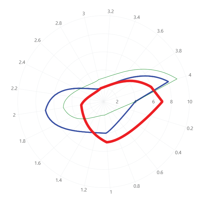
Series = new ISeries[]
{
    new PolarLineSeries<int>
    {
        Values = new [] { 4, 4, 7, 2, 8 },
        Stroke = new SolidColorPaint(SKColors.Blue) { StrokeThickness = 4 }, // mark
        Fill = null,
        GeometryFill = null,
        GeometryStroke = null
    },
    new PolarLineSeries<int>
    {
        Values = new [] { 7, 5, 3, 2, 6 },
        Stroke = new SolidColorPaint(SKColors.Red) { StrokeThickness = 8 }, // mark
        Fill = null,
        GeometryFill = null,
        GeometryStroke = null
    },
    new PolarLineSeries<int>
    {
        Values = new [] { 4, 2, 5, 3, 9 },
        Stroke = new SolidColorPaint(SKColors.Green) { StrokeThickness = 1 }, // mark
        Fill = null,
        GeometryFill = null,
        GeometryStroke = null
    }
};
Fill property
If the fill property is not set, then LiveCharts will create it based on the series position in your series collection and the current theme.
The alpha channel enables transparency, it goes from 0 to 255, 0 is transparent and 255 disables transparency completely.
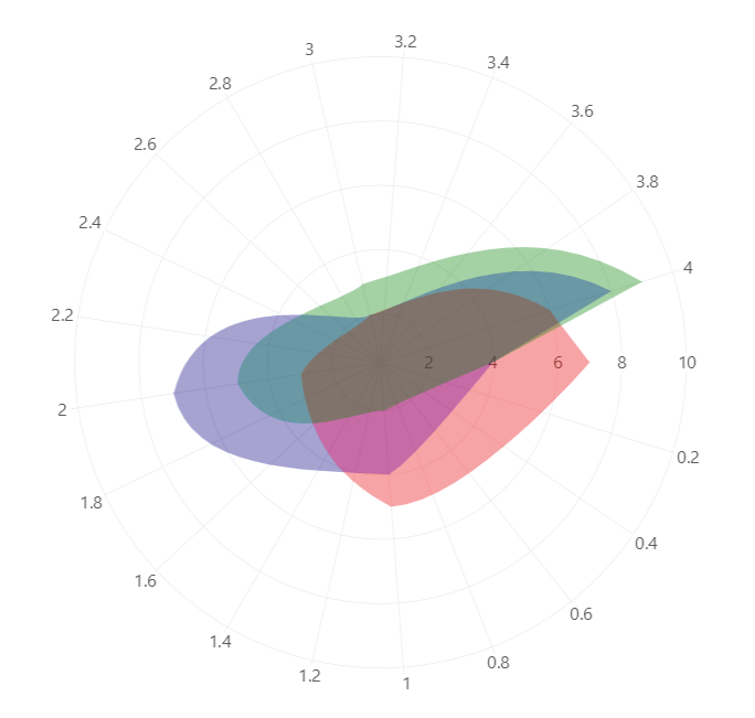
Series = new ISeries[]
{
    new PolarLineSeries<int>
    {
        Values = new [] { 4, 4, 7, 2, 8 },
        Fill = new SolidColorPaint(SKColors.Blue.WithAlpha(90)), // mark
        Stroke = null,
        GeometryFill = null,
        GeometryStroke = null
    },
    new PolarLineSeries<int>
    {
        Values = new [] { 7, 5, 3, 2, 6 },
        Fill = new SolidColorPaint(SKColors.Red.WithAlpha(90)), // mark
        Stroke = null,
        GeometryFill = null,
        GeometryStroke = null
    },
    new PolarLineSeries<int>
    {
        Values = new [] { 4, 2, 5, 3, 9 },
        Fill = new SolidColorPaint(SKColors.Green.WithAlpha(90)), // mark
        Stroke = null,
        GeometryFill = null,
        GeometryStroke = null
    }
};
GeometryFill and GeometryStroke properties
The geometry is the circle shape (by default) that the line series draws for every point, you can customize the fill and stroke of this shape, if none of these properties are set then LiveCharts will create them based on the series position in your series collection and the current theme.
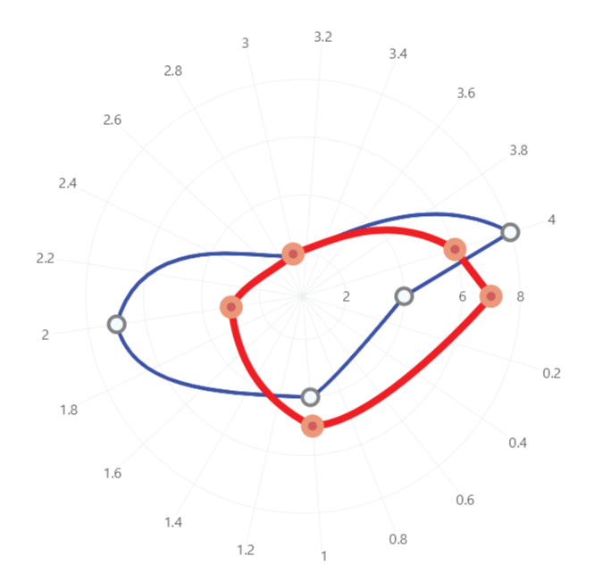
Series = new ISeries[]
{
    new PolarLineSeries<int>
    {
        Values = new [] { 4, 4, 7, 2, 8 },
        Stroke = new SolidColorPaint(SKColors.Blue) { StrokeThickness = 4 },
        Fill = null,
        GeometryFill = new SolidColorPaint(SKColors.AliceBlue), // mark
        GeometryStroke = new SolidColorPaint(SKColors.Gray) { StrokeThickness = 4 } // mark
    },
    new PolarLineSeries<int>
    {
        Values = new [] { 7, 5, 3, 2, 6 },
        Stroke = new SolidColorPaint(SKColors.Red) { StrokeThickness = 8 },
        Fill = null,
        GeometryFill = new SolidColorPaint(SKColors.IndianRed), // mark
        GeometryStroke = new SolidColorPaint(SKColors.DarkSalmon) { StrokeThickness = 8 } // mark
    }
};
GeometrySize property
Determines the size of the geometry, if this property is not set, then the library will decide it based on the theme.
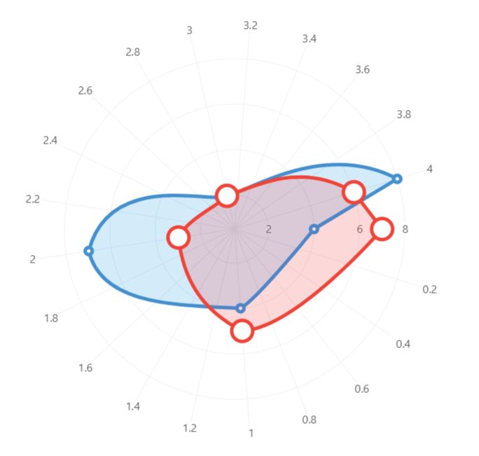
Series = new ISeries[]
{
    new PolarLineSeries<int>
    {
        Values = new [] { 4, 4, 7, 2, 8 },
        GeometrySize = 10 // mark
    },
    new PolarLineSeries<int>
    {
        Values = new [] { 7, 5, 3, 2, 6 },
        GeometrySize = 30 // mark
    }
};
LineSmoothness property
Determines if the series line is straight or curved, this property is of type double and goes from 0 to 1 any other
value will be ignored, where 0 is straight and 1 is the most curved line.
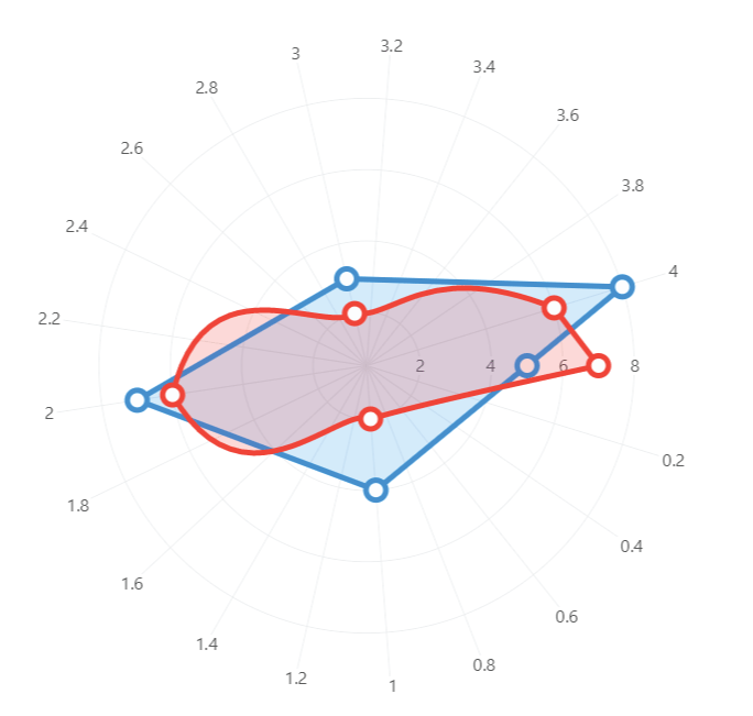
Series = new ISeries[]
{
    new PolarLineSeries<int>
    {
        Values = new [] { 5, 4, 7, 3, 8 },
        LineSmoothness = 0 // mark
    },
    new PolarLineSeries<int>
    {
        Values = new [] { 7, 2, 6, 2, 6 },
        LineSmoothness = 1 // mark
    }
};
EnableNullSplitting property
This property is enabled by default (true), it has a performance cost and allows the series to create gaps, when the
series finds a null instance then the series will create a gap.
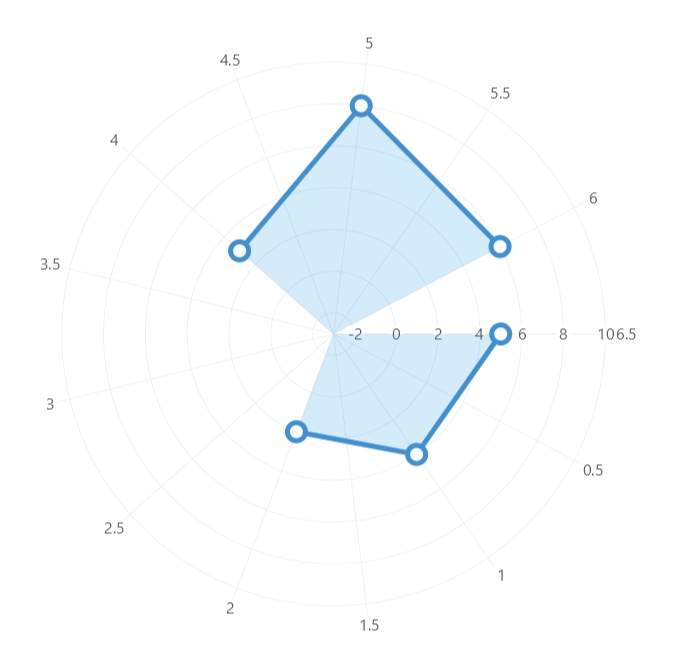
Series = new ISeries[]
{
    new PolarLineSeries<int?>
    {
        Values = new int?[]
        {
            5,
            4,
            2,
            null, // mark
            3,
            8,
            6
        },
        LineSmoothness = 0,
        IsClosed = false
    }
};
Plotting custom types
You can plot any type of data, please see the mappers article for more information.
Custom geometries
You can also customize the geometry for each point in a series, you can use the geometries defined on LiveCharts, SVG geometries or draw your own using the SkiaSharp API, if you want to learn more please take a look at this article.
ZIndex property
Indicates an order in the Z axis, this order controls which series is above or behind.
IsVisible property
Indicates if the series is visible in the user interface.
DataPadding
The data padding is the minimum distance from the edges of the series to the axis limits, it is of type System.Drawing.PointF
both coordinates (X and Y) goes from 0 to 1, where 0 is nothing and 1 is the axis tick an axis tick is the separation between
every label or separator (even if they are not visible).
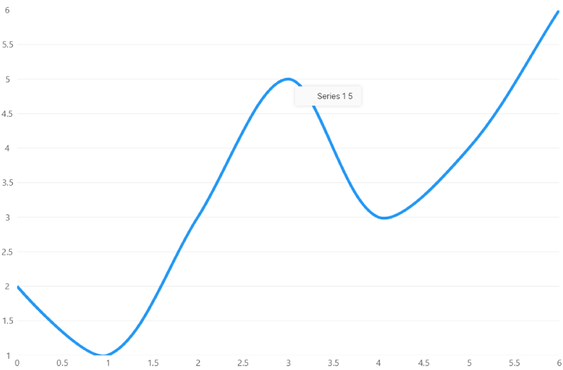
If this property is not set, the library will set it according to the series type, take a look at the following samples:
new LineSeries<double>
{
    DataPadding = new LvcPoint(0, 0),
    Values = new ObservableCollection { 2, 1, 3, 5, 3, 4, 6 },
    GeometryStroke = null,
    GeometryFill = null,
    Fill = null
}
Produces the following result:
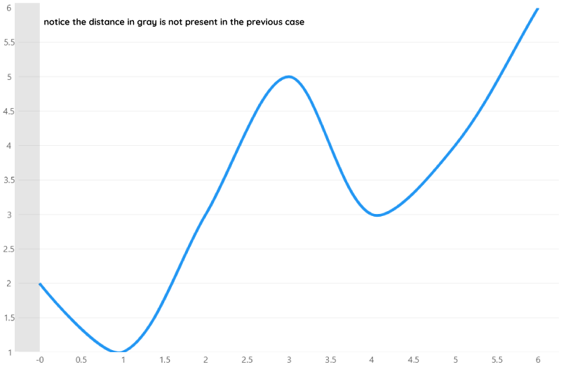
But you can remove the padding only from an axis, for example:
new LineSeries<double>
{
    DataPadding = new LvcPoint(0.5f, 0),
    Values = new ObservableCollection<double> { 2, 1, 3, 5, 3, 4, 6 },
    GeometryStroke = null,
    GeometryFill = null,
    Fill = null
}
Or you can increase the distance:
new LineSeries<double>
{
    DataPadding = new LvcPoint(2, 2),
    Values = new ObservableCollection<double> { 2, 1, 3, 5, 3, 4, 6 },
    GeometryStroke = null,
    GeometryFill = null,
    Fill = null
}