The Polar Chart Control
This article is a quick guide to use the PolarChart control, you can explore all the properties and the source code
at the ApiExplorer.
The PolarChart control is a 'ready to go' control to create plots using the
Polar coordinate system,
To get started all you need to do is assign the Series property with a collection of
IPolarSeries.
Drag a new PolarChart control from your toolbox, then in the code behind assign the Series property:
PolarChart1.Series = new[]
{
    new PolarLineSeries<double>
    {
        Values = new double[] { 15, 14, 13, 12, 11, 10, 9, 8, 7, 6, 5, 4, 3, 2, 1 },
        Fill = null,
        IsClosed = false
    }
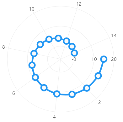
};
The main components of this control are:
- Series
- Axes
- Tooltip
- Legend
But notice in the previous code snippet we did not specify the Axes, Tooltip, Legend or the series colors, this is because LiveCharts will decide them based on the current theme of the library, you can also customize any of these properties when you require it, this article will cover the most common scenarios.
Series
There are multiple series available in the library, you can add one or mix them all in the same chart, every series has unique properties, any image bellow is a link to an article explaining more about them.

InitialRotation property
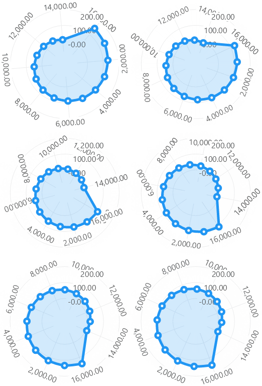
Defines an offset to stablish where the 0 angle is.
Drag a new PolarChart control from your toolbox, then in the code behind assign the Series property:
polarChart1.InitialRotation = -90;Notice a change in the InitialRotation property is animated automatically based on the chart animations settings:
InnerRadius property
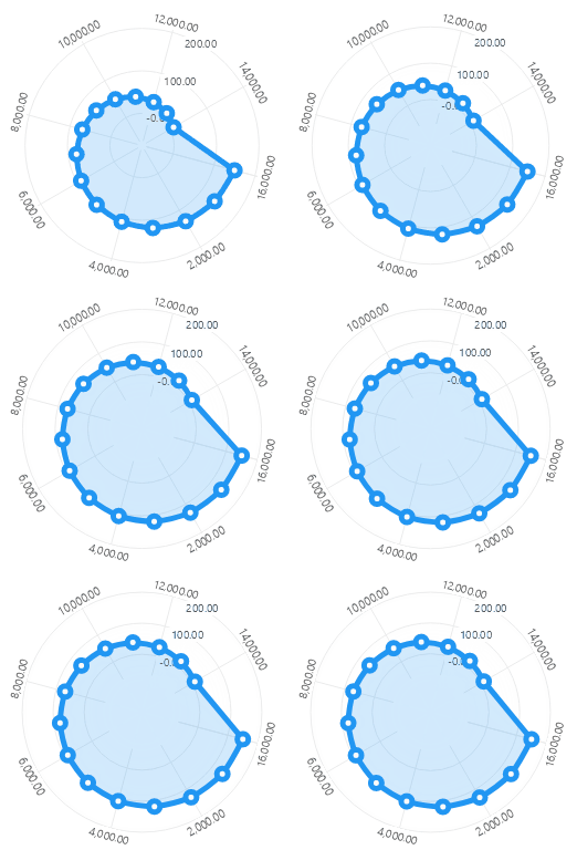
Defines the inner radius in pixels of the chart.
Drag a new PolarChart control from your toolbox, then in the code behind assign the Series property:
polarChart1.InnerRadius = 50;Notice a change in the InnerRadius property is animated automatically based on the chart animations settings:
TotalAngle property
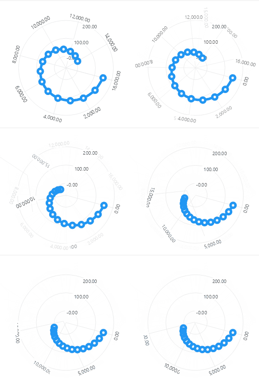
Defines the total circumference angle in degrees, from 0 to 360, default is 360.
Drag a new PolarChart control from your toolbox, then in the code behind assign the Series property:
polarChart1.TotalAngle = 270;Notice a change in the TotalAngle property is animated automatically based on the chart animations settings:
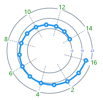
PolarAxis.LabelsPaint and PolarAxis.SeparatorsPaint properties
You can set the color, use dashed lines, build gradients for the axis name, labels and separators, if you need help using Paint instances take
a look at the Paints article.
polarChart1.RadiusAxes = new PolarAxis[]
{
    new PolarAxis
    {
        TextSize = 10,
        LabelsPaint = new SolidColorPaint(SKColors.Blue), // mark

        SeparatorsPaint = new SolidColorPaint(SKColors.LightSlateGray) { StrokeThickness = 2 }  // mark
    }
};

polarChart1.AngleAxes = new PolarAxis[]
{
    new PolarAxis
    {
        LabelsPaint = new SolidColorPaint(SKColors.Green), // mark
        TextSize = 20,

        SeparatorsPaint = new SolidColorPaint(SKColors.LightSlateGray) // mark
        { // mark
            StrokeThickness = 2, // mark
            PathEffect = new DashEffect(new float[] { 3, 3 }) // mark
        } // mark
    }
};
PolarAxis.Labels vs PolarAxis.Labeler properties
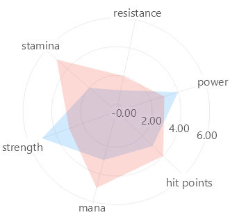
There are 2 ways to format and axis labels, using the Labels property and using the Labeler property,
you must normally use the Labels property to indicate names, and the Labeler property to give format to the current label.
The labels property is a collection of string, if this property is not null, then the axis label will be pulled from the labels
collection, the label is mapped to the chart based on the position of the label and the position of the point, both integers,
if the axis requires a label outside the bounds of the labels collection, then the index will be returned as the label,
default value is null.
polarChart1.Series = new ObservableCollection<ISeries>
{
    new PolarLineSeries<double>
    {
        Values = new ObservableCollection<double> { 5, 2, 1, 4, 3, 3 },
        GeometryFill = null,
        GeometryStroke = null,
        LineSmoothness = 0.2,
        Stroke = null,
        IsClosed = true,
    },
    new PolarLineSeries<double>
    {
        Values = new ObservableCollection<double> { 3, 5, 2, 3, 4, 5 },
        GeometryFill = null,
        GeometryStroke = null,
        LineSmoothness = 0.2,
        Stroke = null,
        IsClosed = true,
    }
};

polarChart1.RadiusAxes = new PolarAxis[]
{
    new PolarAxis
    {
        // formats the value as a number with 2 decimals.
        Labeler = value => value.ToString("N2")
    }
};

polarChart1.AngleAxes = new PolarAxis[]
{
    new PolarAxis
    {
        Labels = new[] { "strength", "stamina", "resistance", "power", "hit points", "mana" },
        MinStep = 1,
        ForceStepToMin = true
    }
};
PolarAxis.LabelsRotation property
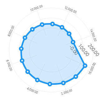
Indicates the axis labels rotation in degrees, in the following image we have a rotation of 45 degrees in the Radius axis, and for the angle axis the labels rotation will follow the tangent line.
RadiusAxes = new PolarAxis[]
{
    new PolarAxis
    {
        LabelsRotation = 45 // mark
    }
};
AngleAxes = new PolarAxis[]
{
    new PolarAxis
    {
        LabelsRotation = LiveCharts.TangentAngle // mark
    }
};
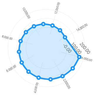
You can also place labels at the cotangent angle:
AngleAxes = new PolarAxis[]
{
    new PolarAxis
    {
        LabelsRotation = LiveCharts.CotangentAngle // mark
    }
};
Finally notice that you can combine the LiveCharts.CotangentAngle and LiveCharts.TangentAngle with decimal degrees,
the following expressions are valid also:
Series { get; set; } = new PolarAxis[]
{
    new PolarAxis
    {
        LabelsRotation = 30, // in degrees
    },
    new PolarAxis
    {
        LabelsRotation = LiveCharts.TangentAngle + 30, // the tangent + 30 degrees
    },
    new PolarAxis
    {
        LabelsRotation = LiveCharts.CotangentAngle + 30, // the cotangent + 30 degrees
    }
};
PolarAxis.Visible property
When the Visible property is set to false the axis will not be drawn and also it will not take any space in the chart
default is true.
AnimationsSpeed property
This section uses the CartesianChart control, but it works the same in the PolarChartControl control.
Defines the animations speed of all the chart elements (axes, series, sections).
cartesianChart1.AnimationsSpeed = TimeSpan.FromMilliseconds(500);EasingFunction property
This section uses the CartesianChart control, but it works the same in the PolarChartControl control.
This property defines the way the shapes in the chart animate, in other words it controls the way the IMotionProperties of all the chart elements (axes, series, sections) in the chart move from a state 'A' to state 'B'.
The property is of type Func<float, float>, it means that it is a function that takes a float argument (the time elapsed from 0 to 1),
and returns float value as the result (the progress of the animation from 0 to 1), you can learn more about easing curves at
this article.
cartesianChart1.EasingFunction = LiveChartsCore.EasingFunctions.BounceOut;Now the chart will animate following the BounceOut curve.
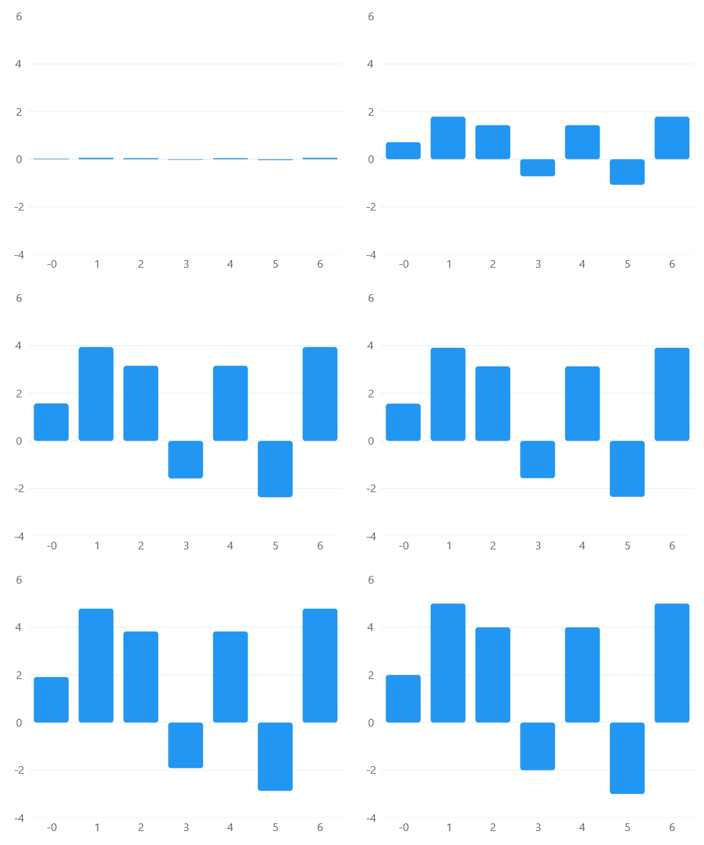
Now try the LiveChartsCore.EasingFunctions.Lineal function, it will animate things lineally as the time elapses.
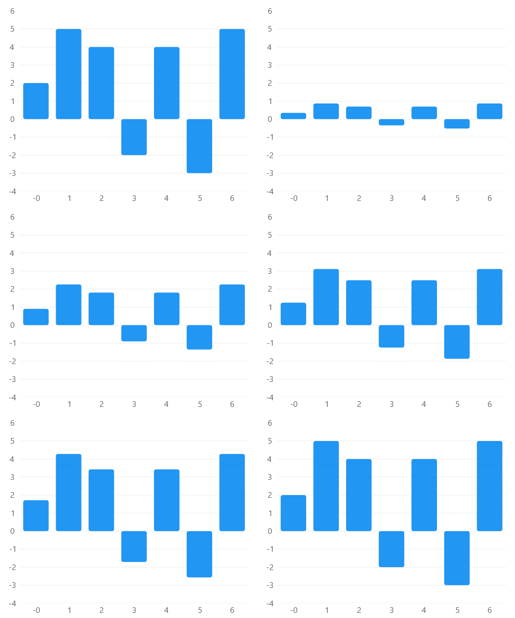
Finally you can also build your own function:
cartesianChart1.EasingFunction = time => time * time;The library also provides some builders based on d3-ease easing curves, the builders.
Func easingCurve = LiveChartsCore.EasingFunctions.BuildCustomBackOut(0.8f);
Func easingCurve = LiveChartsCore.EasingFunctions.BuildCustomElasticOut(0.8f, 1.1f);
// there are more builders, check them out all, they start with Build{ function }({ args })
Disable animations
This section uses the CartesianChart control, but it works the same in the PolarChartControl control.
Settings the EasingFunction to null disables animations.
cartesianChart1.EasingFunction = null; // markDisabling animations will not improve performance drastically: if you come from LiveCharts 0.x version then
maybe you are thinking that disabling animations will improve the performance of the library, in most of the cases
that is not true, animations are not the bottle neck in performance in LiveCharts 2.x, normally you must need to
clean your code somewhere else, not here, plus we put a lot of effort building the animations of the library, please
just do not disable them 😭, instead try to make them run faster, animating data visualization normally brings
an excellent user experience.
DrawMargin property
This section uses the CartesianChart control, but it works the same in the PolarChartControl control.
Defines the distance from the axes (or edge of the chart if there is no axis) to the draw margin area.
// Notice the constructor of the Margin class has multiple overloads
// https://livecharts.dev/api/2.0.0-rc1/LiveChartsCore.Measure.Margin
cartesianChart1.DrawMargin = new LiveChartsCore.Measure.Margin(100);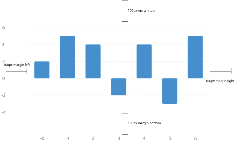
Tooltips
This section uses the CartesianChart control, but it works the same in the PolarChartControl control.
Tooltips are popups that help the user to read a chart as the pointer moves.
This is a brief sample about how to use the main features of the IChartTooltip<T> interface, you can find a more detailed article at the button below or at the
API explorer.
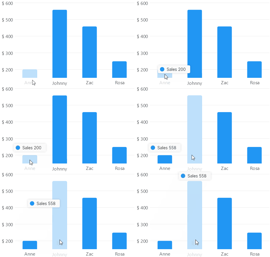
You can place a tooltip at Top, Bottom, Left, Right, Center or Hidden positions, for now
tooltips for the PieChart class only support the Center position, default value is Top.
Notice the Hidden position will disable tooltips in a chart.
cartesianChart1.Series = new ISeries[] { new LineSeries<int> { Values = new[] { 2, 5, 4 } } };
cartesianChart1.TooltipPosition = LiveChartsCore.Measure.TooltipPosition.Bottom;
Legends
This section uses the CartesianChart control, but it works the same in the PolarChartControl control.
A legend is a visual element that displays a list with the name, stroke and fills of the series in a chart:
This is a brief sample about how to use the main features of the IChartLegend<T> interface, you can find a more detailed article at the button below or at the
API explorer.
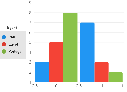
You can place a legend at Top, Bottom, Left, Right or Hidden positions, notice the Hidden position will
disable legends in a chart, default value is Hidden.
cartesianChart1.TooltipPosition = LiveChartsCore.Measure.LegendPosition.Bottom; // mark
// or use Top, Left, Right or Hidden