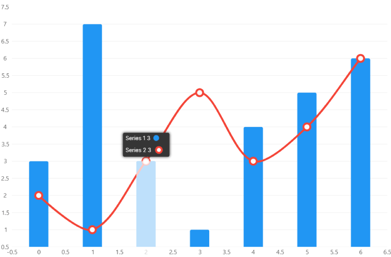
Tooltips
Tooltips are popups that help the user to read a chart as the pointer moves.
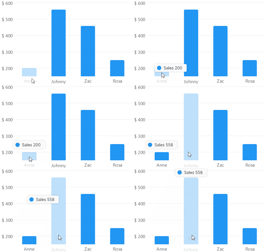
TooltipPosition property
You can place a tooltip at Top, Bottom, Left, Right, Center or Hidden positions, for now
tooltips for the PieChart class only support the Center position, default value is Top.
Notice the Hidden position will disable tooltips in a chart.
<CartesianChart
    Series="series"
    TooltipPosition="LiveChartsCore.Measure.TooltipPosition.Top"><!-- mark -->
</CartesianChart>
<CartesianChart
    Series="series"
    TooltipPosition="LiveChartsCore.Measure.TooltipPosition.Bottom"><!-- mark -->
</CartesianChart>
<CartesianChart
    Series="series"
    TooltipPosition="LiveChartsCore.Measure.TooltipPosition.Left"><!-- mark -->
</CartesianChart>
<CartesianChart
    Series="series"
    TooltipPosition="LiveChartsCore.Measure.TooltipPosition.Right"><!-- mark -->
</CartesianChart>
<CartesianChart
    Series="series"
    TooltipPosition="LiveChartsCore.Measure.TooltipPosition.Center"><!-- mark -->
</CartesianChart>
<CartesianChart
    Series="series"
    TooltipPosition="LiveChartsCore.Measure.TooltipPosition.Hidden"><!-- mark -->
</CartesianChart>
TooltipFindingStrategy property
Every point drawn by the library defines a HoverArea, it defines an area in the chart that "triggers" the point, it is specially important to fire tooltips, a point will be included in a tooltip when the hover area was triggered by the pointer position.
The TooltipFindingStrategy property determines the hover area planes (X or Y) that a chart will use to trigger the HoverArea instances.
In a chart, the following options are available:
CompareAll: Selects all the points whose hover area contain the pointer position.
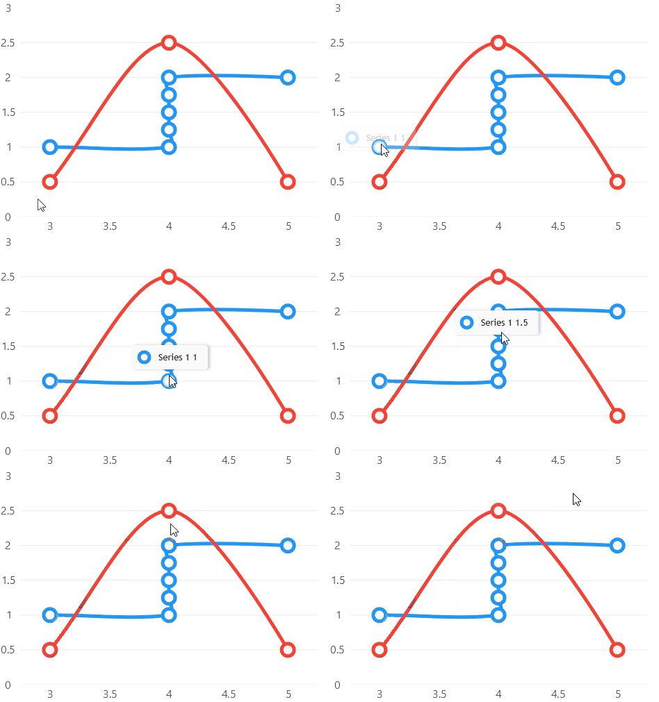
CompareOnlyX: Selects all the points whose hover area contain the pointer position, but it ignores the Y plane.
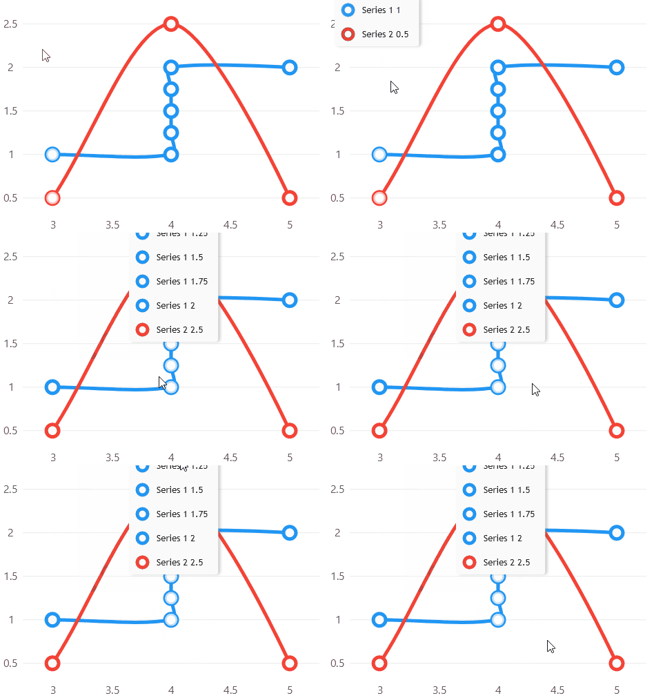
CompareOnlyY: Selects all the points whose hover area contain the pointer position, but it ignores the X plane.
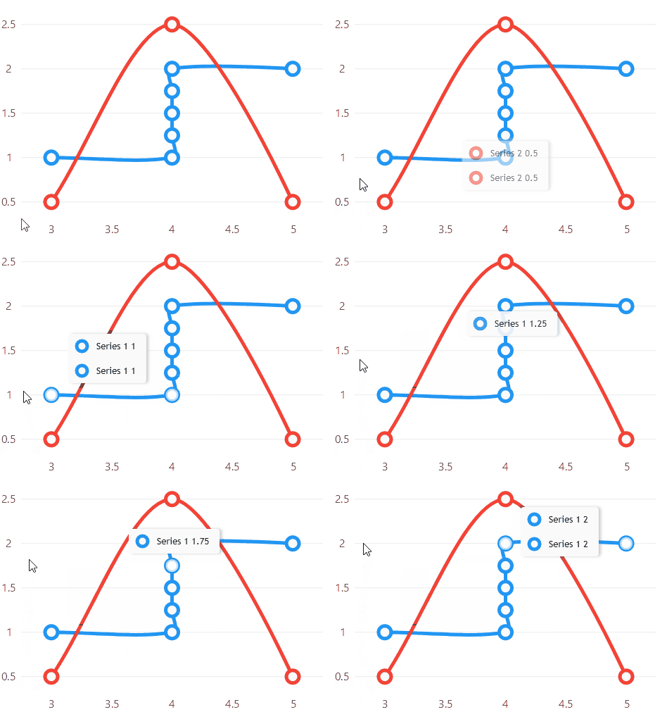
CompareAllTakeClosest: Selects all the points whose hover area contain the pointer position, it only takes the closest point to the pointer, one per series.
CompareOnlyXTakeClosest: Selects all the points whose hover area contain the pointer position, but it ignores the Y plane, it only takes the closest point to the pointer, one per series.
CompareOnlyYTakeClosest: Selects all the points whose hover area contain the pointer position, but it ignores the X plane, it only takes the closest point to the pointer, one per series.
Automatic (default): Based on the series in the chart, LiveCharts will determine a finding strategy (one of the previous mentioned),
all the series have a preferred finding strategy, normally vertical series prefer the CompareOnlyXTakeClosest strategy,
horizontal series prefer CompareOnlyYTakeClosest, and scatter series prefers CompareAllTakeClosest, if all the series prefer the same strategy, then that
strategy will be selected for the chart, if any series differs then the CompareAllTakeClosest strategy will be used.
Notice that the Axis.UnitWidth property might affect the tooltips in DateTime scaled charts, ensure your chart axis is using
the properly unit width.
<CartesianChart
    Series="series"
    TooltipFindingStrategy="LiveChartsCore.Measure.TooltipFindingStrategy.CompareOnlyX"><!-- mark -->
</CartesianChart>
Tooltip point text
You can define the text the tooltip will display for a given point, using the Series.TooltipLabelFormatter property, this
property is of type Func<ChartPoint, string> this means that is is a function, that takes a point as parameter
and returns a string, the point will be injected by LiveCharts in this function to get a string out of it when it
requires to build the text for a point in a tooltip, the injected point will be different as the user moves the pointer over the
user interface.
By default the library already defines a default TooltipLabelFormatter for every series, all the series have a different
formatter, but generally the default value uses the Series.Name and the ChartPoint.PrimaryValue properties, the following
code snippet illustrates how to build a custom tooltip formatter.
new LineSeries<double>
{
    Name = "Sales",
    Values = new ObservableCollection<double> { 200, 558, 458 },
    // for the following formatter
    // when the pointer is over the first point (200), the tooltip will display:
    // Sales: 200
    TooltipLabelFormatter =
        (chartPoint) => $"{chartPoint.Context.Series.Name}: {chartPoint.PrimaryValue}"
},

new ColumnSeries<double>
{
    Name = "Sales 2",
    Values = new ObservableCollection<double> { 250, 350, 240 },
    // now it will use a currency formatter to display the primary value
    // result: Sales 2: $200.00
    TooltipLabelFormatter =
        (chartPoint) => $"{chartPoint.Context.Series.Name}: {chartPoint.PrimaryValue:C2}"
},

new StepLineSeries<ObservablePoint>
{
    Name = "Average",
    Values = new ObservableCollection<ObservablePoint>
    {
        new ObservablePoint(10, 5),
        new ObservablePoint(5, 8)
    },
    // We can also display both coordinates (X and Y in a cartesian coordinate system)
    // result: Average: 10, 5
    TooltipLabelFormatter =
        (chartPoint) => $"{chartPoint.Context.Series.Name}: {chartPoint.SecondaryValue}, {chartPoint.PrimaryValue}"
},

new ColumnSeries<ObservablePoint>
{
    Values = new ObservableCollection<double> { 250, 350, 240 },
    // or anything...
    // result: Sales at this moment: $200.00
    TooltipLabelFormatter =
        (chartPoint) => $"Sales at this moment: {chartPoint.PrimaryValue:C2}"
}
Customize default tooltips
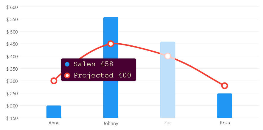
You can quickly change the position, the font, the text size or the background color:
View
@page "/Axes/NamedLabels"
@using LiveChartsCore.SkiaSharpView.Blazor
@using ViewModelsSamples.Axes.NamedLabels

<style>
	/*
		You can also use css to override the styles.
	*/

	.lvc-tooltip {
		background-color: #480032 !important;
	}

	.lvc-tooltip-item {
		font-family: SFMono-Regular,Menlo,Monaco,Consolas !important;
		color: #F2F4C3 !important;
	}
</style>

<CartesianChart
	Series="ViewModel.Series"
	XAxes="ViewModel.XAxes"
	YAxes="ViewModel.YAxes"
    TooltipPosition="LiveChartsCore.Measure.TooltipPosition.Left"
    TooltipBackgroundPaint="ViewModel.TooltipBackgroundPaint"
    TooltipTextPaint="ViewModel.TooltipTextPaint"
    TooltipTextSize="16">
</CartesianChart>

@code {
	public ViewModel ViewModel { get; set; } = new();
}
View model
[ObservableObject]
public partial class ViewModel
{
    public ISeries[] Series { get; set; } = { ... };
    public Axis[] XAxes { get; set; } = { ... };
    public Axis[] YAxes { get; set; } = { ... };

    public SolidColorPaint TooltipTextPaint { get; set; } = // mark
        new SolidColorPaint // mark
        { // mark
            Color = new SKColor(242, 244, 195), // mark
            SKTypeface = SKTypeface.FromFamilyName("Courier New") // mark
        }; // mark

    public SolidColorPaint TooltipBackgroundPaint { get; set; } = // mark
        new SolidColorPaint(new SKColor(72, 0, 50)); // mark
}
Custom tooltip control
You can also create your own tooltip, the recommended way is to use the LiveCharts API (example bellow) but you can
use anything as tooltip as soon as it implements the IChartTooltip<T> interface. In the following example we build
a custom control to render tooltips in out charts using the LiveCharts API.
CustomTooltip.cs
using System;
using System.Collections.Generic;
using LiveChartsCore;
using LiveChartsCore.Drawing;
using LiveChartsCore.Kernel;
using LiveChartsCore.Kernel.Sketches;
using LiveChartsCore.SkiaSharpView.Drawing;
using LiveChartsCore.SkiaSharpView.Drawing.Geometries;
using LiveChartsCore.SkiaSharpView.Painting;
using LiveChartsCore.SkiaSharpView.VisualElements;
using LiveChartsCore.VisualElements;
using SkiaSharp;

namespace ViewModelsSamples.General.TemplatedTooltips;

public class CustomTooltip : IChartTooltip<SkiaSharpDrawingContext>
{
    private StackPanel<RoundedRectangleGeometry, SkiaSharpDrawingContext>? _stackPanel;
    private static readonly int s_zIndex = 10100;
    private readonly SolidColorPaint _backgroundPaint = new(new SKColor(28, 49, 58)) { ZIndex = s_zIndex };
    private readonly SolidColorPaint _fontPaint = new(new SKColor(230, 230, 230)) { ZIndex = s_zIndex + 1 };

    public void Show(IEnumerable<ChartPoint> foundPoints, Chart<SkiaSharpDrawingContext> chart)
    {
        if (_stackPanel is null)
        {
            _stackPanel = new StackPanel<RoundedRectangleGeometry, SkiaSharpDrawingContext>
            {
                Padding = new Padding(25),
                Orientation = ContainerOrientation.Vertical,
                HorizontalAlignment = Align.Start,
                VerticalAlignment = Align.Middle,
                BackgroundPaint = _backgroundPaint
            };

            _stackPanel
                .Animate(
                    new Animation(EasingFunctions.BounceOut, TimeSpan.FromSeconds(1)),
                    nameof(_stackPanel.X),
                    nameof(_stackPanel.Y));
        }

        // clear the previous elements.
        foreach (var child in _stackPanel.Children.ToArray())
        {
            _ = _stackPanel.Children.Remove(child);
            chart.RemoveVisual(child);
        }

        foreach (var point in foundPoints)
        {
            var sketch = ((IChartSeries<SkiaSharpDrawingContext>)point.Context.Series).GetMiniaturesSketch();
            var relativePanel = sketch.AsDrawnControl(s_zIndex);

            var label = new LabelVisual
            {
                Text = point.Coordinate.PrimaryValue.ToString("C2"),
                Paint = _fontPaint,
                TextSize = 15,
                Padding = new Padding(8, 0, 0, 0),
                VerticalAlignment = Align.Start,
                HorizontalAlignment = Align.Start
            };

            var sp = new StackPanel<RoundedRectangleGeometry, SkiaSharpDrawingContext>
            {
                Padding = new Padding(0, 4),
                VerticalAlignment = Align.Middle,
                HorizontalAlignment = Align.Middle,
                Children =
                {
                    relativePanel,
                    label
                }
            };

            _stackPanel?.Children.Add(sp);
        }

        var size = _stackPanel.Measure(chart);

        var location = foundPoints.GetTooltipLocation(size, chart);

        _stackPanel.X = location.X;
        _stackPanel.Y = location.Y;

        chart.AddVisual(_stackPanel);
    }

    public void Hide(Chart<SkiaSharpDrawingContext> chart)
    {
        if (chart is null || _stackPanel is null) return;
        chart.RemoveVisual(_stackPanel);
    }
}
View
@page "/General/TemplatedTooltips"
@using LiveChartsCore.SkiaSharpView.Blazor
@using ViewModelsSamples.General.TemplatedTooltips

<CartesianChart
    Series="ViewModel.Series"
    Tooltip="CustomTooltip">
</CartesianChart>

@code {
    public ViewModel ViewModel { get; set; } = new();
    public CustomTooltip CustomTooltip { get; set; } = new();
}
