Customize default tooltips
The next article is a quick guide on how to customize the default tooltip,if you want to learn more you can read the full article:
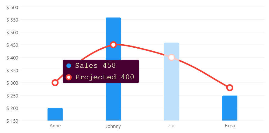
Go to the full tooltips articleYou can quickly change the position, the font, the text size or the background color:
View
<?xml version="1.0" encoding="utf-8" ?>
<ContentPage x:Class="MauiSample.Axes.NamedLabels.View"
             xmlns="http://schemas.microsoft.com/dotnet/2021/maui"
             xmlns:x="http://schemas.microsoft.com/winfx/2009/xaml"
             xmlns:lvc="clr-namespace:LiveChartsCore.SkiaSharpView.Maui;assembly=LiveChartsCore.SkiaSharpView.Maui"
             xmlns:vms="clr-namespace:ViewModelsSamples.Axes.NamedLabels;assembly=ViewModelsSamples"
             >
    <ContentPage.BindingContext>
        <vms:ViewModel/>
    </ContentPage.BindingContext>
	<ContentPage.Content>
        <Grid>
            <Grid.RowDefinitions>
                <RowDefinition Height="*"/>
            </Grid.RowDefinitions>

            <lvc:CartesianChart
                Series="{Binding Series}"
                XAxes="{Binding XAxes}"
                YAxes="{Binding YAxes}"
                TooltipPosition="Left"
                TooltipBackgroundPaint="{Binding TooltipBackgroundPaint}"
                TooltipTextPaint="{Binding TooltipTextPaint}"
                TooltipTextSize="16">
            </lvc:CartesianChart>

        </Grid>
    </ContentPage.Content>
</ContentPage>
View model
[ObservableObject]
public partial class ViewModel
{
    public ISeries[] Series { get; set; } = { ... };
    public Axis[] XAxes { get; set; } = { ... };
    public Axis[] YAxes { get; set; } = { ... };

    public SolidColorPaint TooltipTextPaint { get; set; } = // mark
        new SolidColorPaint // mark
        { // mark
            Color = new SKColor(242, 244, 195), // mark
            SKTypeface = SKTypeface.FromFamilyName("Courier New") // mark
        }; // mark

    public SolidColorPaint TooltipBackgroundPaint { get; set; } = // mark
        new SolidColorPaint(new SKColor(72, 0, 50)); // mark
}
Customize tooltip format
You can define the text the tooltip will display for a given point, using the
YToolTipLabelFormatter, XToolTipLabelFormatter or ToolTipLabelFormatter properties, these
properties are of type Func<ChartPoint, string> it means that both are a function, that takes a point as parameter
and return a string, the point will be injected by LiveCharts in this function to get a string out of it when it
requires to build the text for a point in a tooltip, the injected point will be different as the user moves the pointer over the
user interface.
By default the library already defines a default formatter for every series, all the series have a different
formatters, but generally the default value uses the Series.Name and the ChartPoint.Coordinate.PrimaryValue properties, the following
code snippet illustrates how to build a custom tooltip formatter.
Lets take the example of the next series:"
public ISeries[] Series { get; set; } = [
    new LineSeries<double>
    {
        Values = [2, 1, 3, 5, 3, 4, 6],
        Fill = null,
        GeometrySize = 20,
    },
    new LineSeries<int, StarGeometry>
    {
        Values = [4, 2, 5, 2, 4, 5, 3],
        Fill = null,
        GeometrySize = 20
    }
];
By default the tooltip will be:

We can add format to the tooltip:
public ISeries[] Series { get; set; } = [
    new LineSeries<double>
    {
        Values = [2, 1, 3, 5, 3, 4, 6],
        Fill = null,
        GeometrySize = 20,
        YToolTipLabelFormatter = point => point.Model.ToString("N2") // mark
    },
    new LineSeries<int, StarGeometry>
    {
        Values = [4, 2, 5, 2, 4, 5, 3],
        Fill = null,
        GeometrySize = 20,
        YToolTipLabelFormatter = point => point.Model.ToString("N2") // mark
    }
];
We used the Model property of the point, the Model property is just the item in the Values
collection, for example in the next case, the Model property is of type City.
public ISeries[] Series { get; set; } = [
    new LineSeries<City>
    {
        Values = [new() { Population = 4 }, new() { Population = 2}],
        YToolTipLabelFormatter = point => point.Model.Population.ToString("N2") // mark
    }
];

// ...

public class City
{
    public double Population { get; set; }
}
We can also show a label for the X coordinate, the default tooltip uses the X label as the header in the tooltip.
new LineSeries<double>
{
    Values = [2, 1, 3, 5, 3, 4, 6],
    Fill = null,
    GeometrySize = 20,
    XToolTipLabelFormatter = point => point.Index.ToString(), // mark
    YToolTipLabelFormatter = point => point.Model.ToString("C2")
};
When the series is "Stacked" (PieSeries, StackedColumn or StackedRow) we can find information about the stacked data
in the StackedValue property, for example:
public ISeries[] Series { get; set; } = [
    new StackedColumnSeries<double>
    {
        Values = [2, 1, 3, 5, 3, 4, 6],
        YToolTipLabelFormatter =
            point => $"{point.Model} / {point.StackedValue!.Total} ({point.StackedValue.Share:P2})"
    },
    new StackedColumnSeries<int>
    {
        Values = [4, 2, 5, 2, 4, 5, 3],
        YToolTipLabelFormatter =
            point => $"{point.Model} / {point.StackedValue!.Total} ({point.StackedValue.Share:P2})"
    }
];
Will result in:

The PieSeries class uses the ToolTipLabelFormatter property to configure the text inside the tooltip.
Tooltip control from scratch
You can also create your own tooltip, the recommended way is to use the LiveCharts API (example bellow) but you can
use anything as tooltip as soon as it implements the IChartTooltip<T> interface. AT the following example we build
a custom control to render tooltips in our charts using the LiveCharts API.
The next tooltip is drawn by the library, LiveCharts can only draw inside the control bounds, in some cases it could cause issues like #912.
Alternatively, you can build your own Tooltips and use the power of your UI framework, see #1558 for more info.
CustomTooltip.cs
using System;
using System.Collections.Generic;
using LiveChartsCore;
using LiveChartsCore.Drawing;
using LiveChartsCore.Kernel;
using LiveChartsCore.Kernel.Sketches;
using LiveChartsCore.Measure;
using LiveChartsCore.SkiaSharpView.Drawing;
using LiveChartsCore.SkiaSharpView.Drawing.Geometries;
using LiveChartsCore.SkiaSharpView.Painting;
using LiveChartsCore.SkiaSharpView.VisualElements;
using LiveChartsCore.VisualElements;
using SkiaSharp;

namespace ViewModelsSamples.General.TemplatedTooltips;

public class CustomTooltip : IChartTooltip<SkiaSharpDrawingContext>
{
    private StackPanel<RoundedRectangleGeometry, SkiaSharpDrawingContext>? _stackPanel;
    private static readonly int s_zIndex = 10100;
    private readonly SolidColorPaint _backgroundPaint = new(new SKColor(28, 49, 58)) { ZIndex = s_zIndex };
    private readonly SolidColorPaint _fontPaint = new(new SKColor(230, 230, 230)) { ZIndex = s_zIndex + 1 };

    public void Show(IEnumerable<ChartPoint> foundPoints, Chart<SkiaSharpDrawingContext> chart)
    {
        if (_stackPanel is null)
        {
            _stackPanel = new StackPanel<RoundedRectangleGeometry, SkiaSharpDrawingContext>
            {
                Padding = new Padding(25),
                Orientation = ContainerOrientation.Vertical,
                HorizontalAlignment = Align.Start,
                VerticalAlignment = Align.Middle,
                BackgroundPaint = _backgroundPaint
            };

            _stackPanel
                .Animate(
                    new Animation(EasingFunctions.BounceOut, TimeSpan.FromSeconds(1)),
                    nameof(_stackPanel.X),
                    nameof(_stackPanel.Y));
        }

        // clear the previous elements.
        foreach (var child in _stackPanel.Children.ToArray())
        {
            _ = _stackPanel.Children.Remove(child);
            chart.RemoveVisual(child);
        }

        foreach (var point in foundPoints)
        {
            var skiaSeries = (IChartSeries<SkiaSharpDrawingContext>)point.Context.Series;

            var label = new LabelVisual
            {
                Text = point.Coordinate.PrimaryValue.ToString("C2"),
                Paint = _fontPaint,
                TextSize = 15,
                Padding = new Padding(8, 0, 0, 0),
                ClippingMode = ClipMode.None, // required on tooltips // mark
                VerticalAlignment = Align.Start,
                HorizontalAlignment = Align.Start
            };

            var sp = new StackPanel<RoundedRectangleGeometry, SkiaSharpDrawingContext>
            {
                Padding = new Padding(0, 4),
                VerticalAlignment = Align.Middle,
                HorizontalAlignment = Align.Middle,
                Children =
                {
                    skiaSeries.GetMiniature(point, s_zIndex),
                    label
                }
            };

            _stackPanel.Children.Add(sp);
        }

        var size = _stackPanel.Measure(chart);

        var location = foundPoints.GetTooltipLocation(size, chart);

        _stackPanel.X = location.X;
        _stackPanel.Y = location.Y;

        chart.AddVisual(_stackPanel);
    }

    public void Hide(Chart<SkiaSharpDrawingContext> chart)
    {
        if (chart is null || _stackPanel is null) return;
        chart.RemoveVisual(_stackPanel);
    }
}
View
<?xml version="1.0" encoding="utf-8" ?>
<ContentPage x:Class="MauiSample.General.TemplatedTooltips.View"
             xmlns="http://schemas.microsoft.com/dotnet/2021/maui"
             xmlns:x="http://schemas.microsoft.com/winfx/2009/xaml"
             xmlns:lvc="clr-namespace:LiveChartsCore.SkiaSharpView.Maui;assembly=LiveChartsCore.SkiaSharpView.Maui"
             xmlns:vms="clr-namespace:ViewModelsSamples.General.TemplatedTooltips;assembly=ViewModelsSamples"
             >

    <ContentPage.BindingContext>
        <vms:ViewModel/>
    </ContentPage.BindingContext>

    <ContentPage.Content>
        <Grid>
            <Grid.RowDefinitions>
                <RowDefinition Height="*"/>
            </Grid.RowDefinitions>

            <lvc:CartesianChart
                Grid.Row="0"
                Series="{Binding Series}">
                <!-- mark -untilCloses CartesianChart.Tooltip -->
                <lvc:CartesianChart.Tooltip>
                    <vms:CustomTooltip></vms:CustomTooltip>
                </lvc:CartesianChart.Tooltip>
            </lvc:CartesianChart>
        </Grid>
    </ContentPage.Content>
</ContentPage>
